That’s the Rub!

Inspired by the amazing Terry Maker, who has an installation at the Longmont Museum right now, I’ve been exploring making rubbings the last few weeks.  Now, before you start thinking “That’s just for kindergartners,”  it is actually an honest-to-goodness art technique, going by the name frottage, and used most famously by surrealist painter Max Ernst.

If you’d like to try it along with me, here’s a tutorial!

MATERIALS:
paper. 
Preferably blank and lightweight, but be creative; use the “this page intentionally left blank” page from something, or a brown paper lunch sack!
pencil or crayons.  Softer pencil lead (B or 2B) gives a darker impression than HB, but they all work. Kids’ crayons can be fun.  Colored pencils work nicely.  Any of the above should be sharp, so you have a large flat surface along the side of the point. (mechanical pencil won’t work.)
textures to rub over.  This can be anything with a hard textured surface.  (Fabric doesn’t work well unless you can stretch it taught over a hard surface.)  Once you start looking for textures, you will start seeing them in unexpected places!  Experiment!  Use scratch paper to test things for suitability. Or make your own texture plates; see below.
Optional:
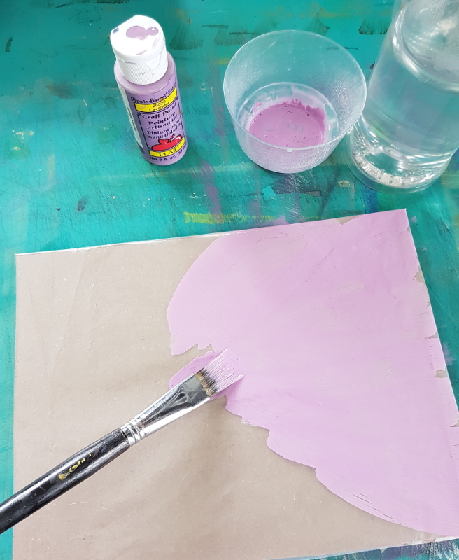
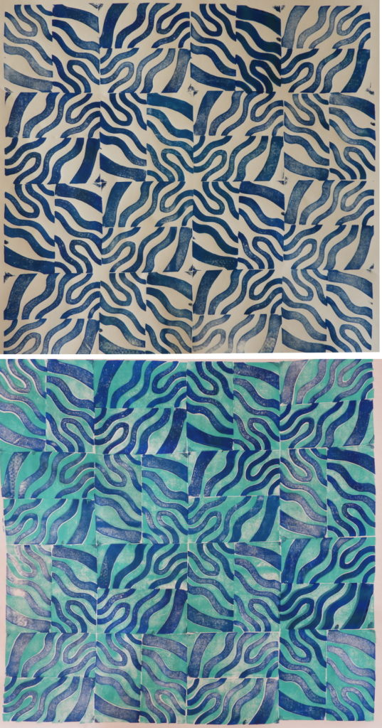
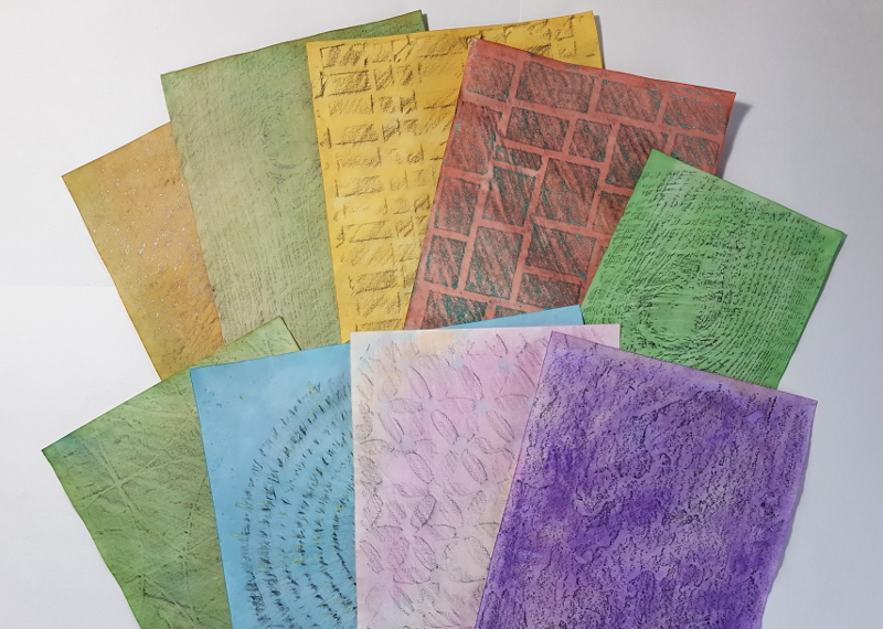
watercolor paints. 
These don’t need to be artists’ grade (although they could be.) The kids’ pan sets that you can buy anywhere for a couple bucks will work.
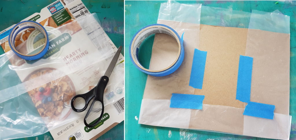
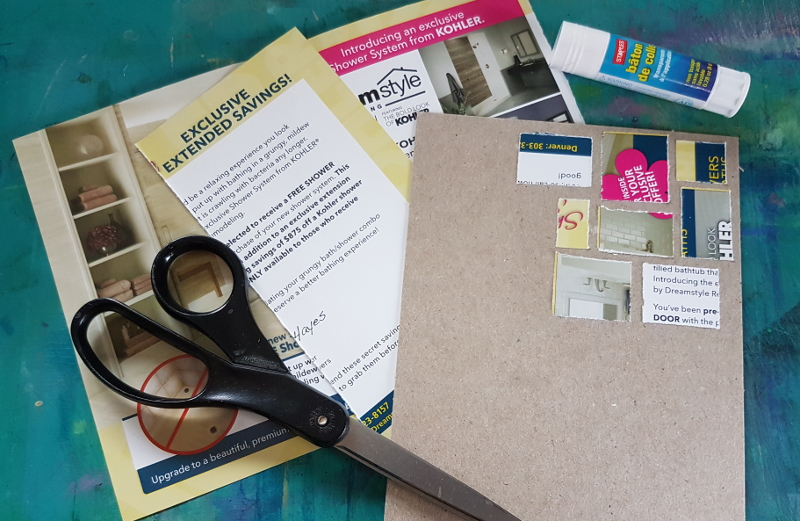
lightweight card-stock and a glue stick, if you want to make your own rubbing plates.  Junk mail postcards are perfect for this, and the cardboard from a cereal or cracker box for the backing.

PROCESS: 
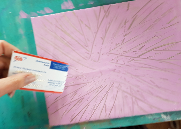
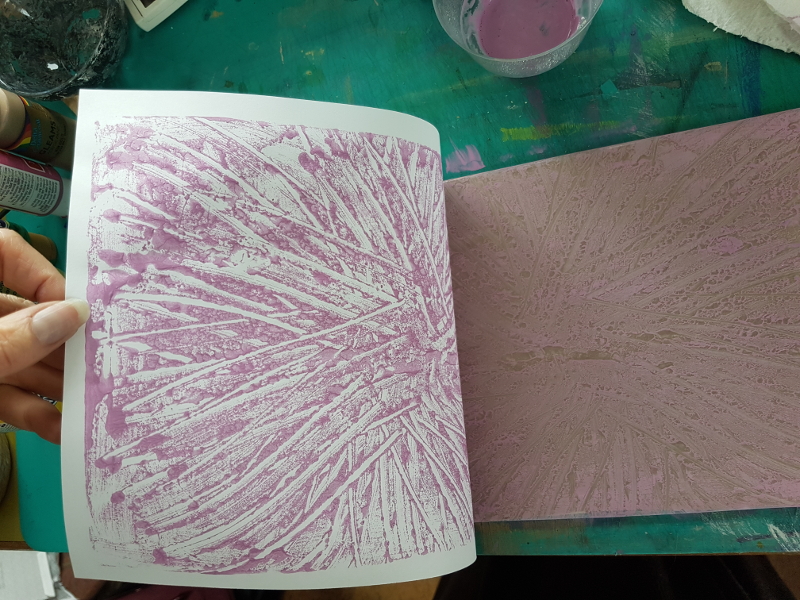
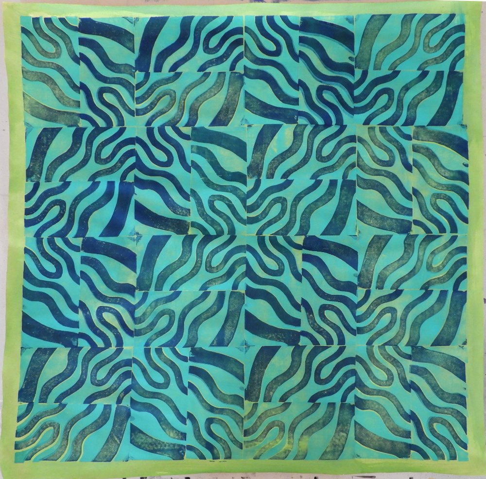
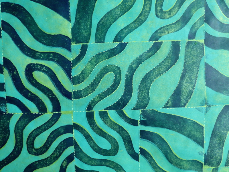
There are two styles of rubbings; over “found” texture, or over “created” texture. 

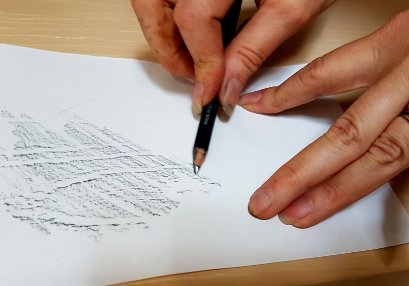
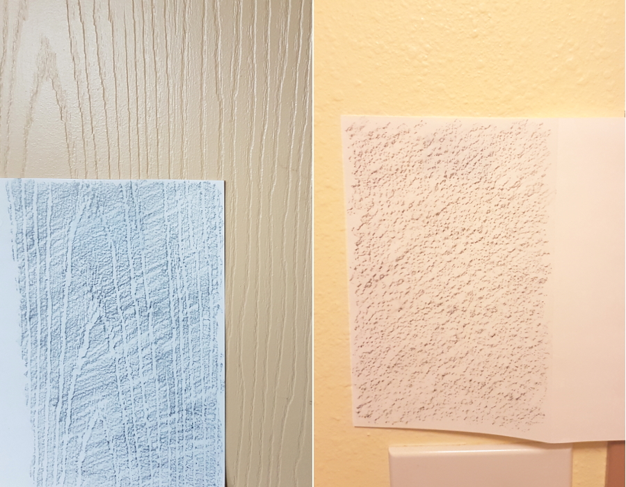
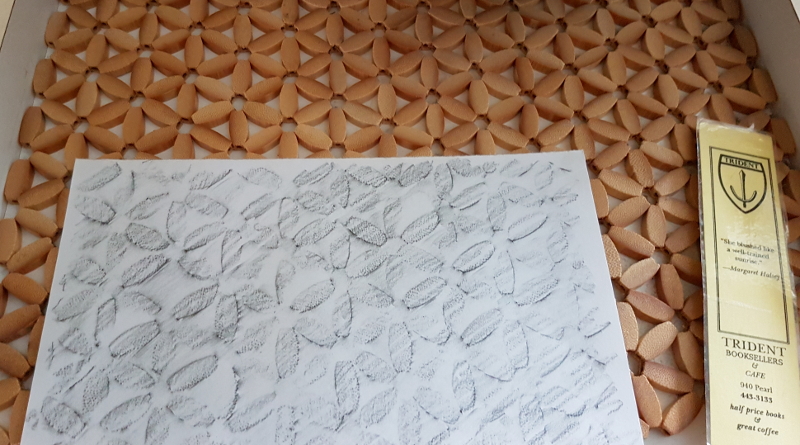
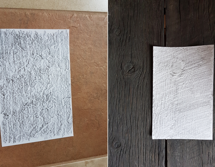
Let’s start with found texture; things around the house to make rubbings of.  Find something you want to make a rubbing of, tape or hold your paper over it, and start rubbing with the flat side of the tip of your pencil or crayon.  The angle at which you hold the mark-making tool will change the character of the marks!

Can you see how flat to the paper I am holding the pencil?  You can also tell I was pulling dandelions right before I did this; my fingers are all stained!

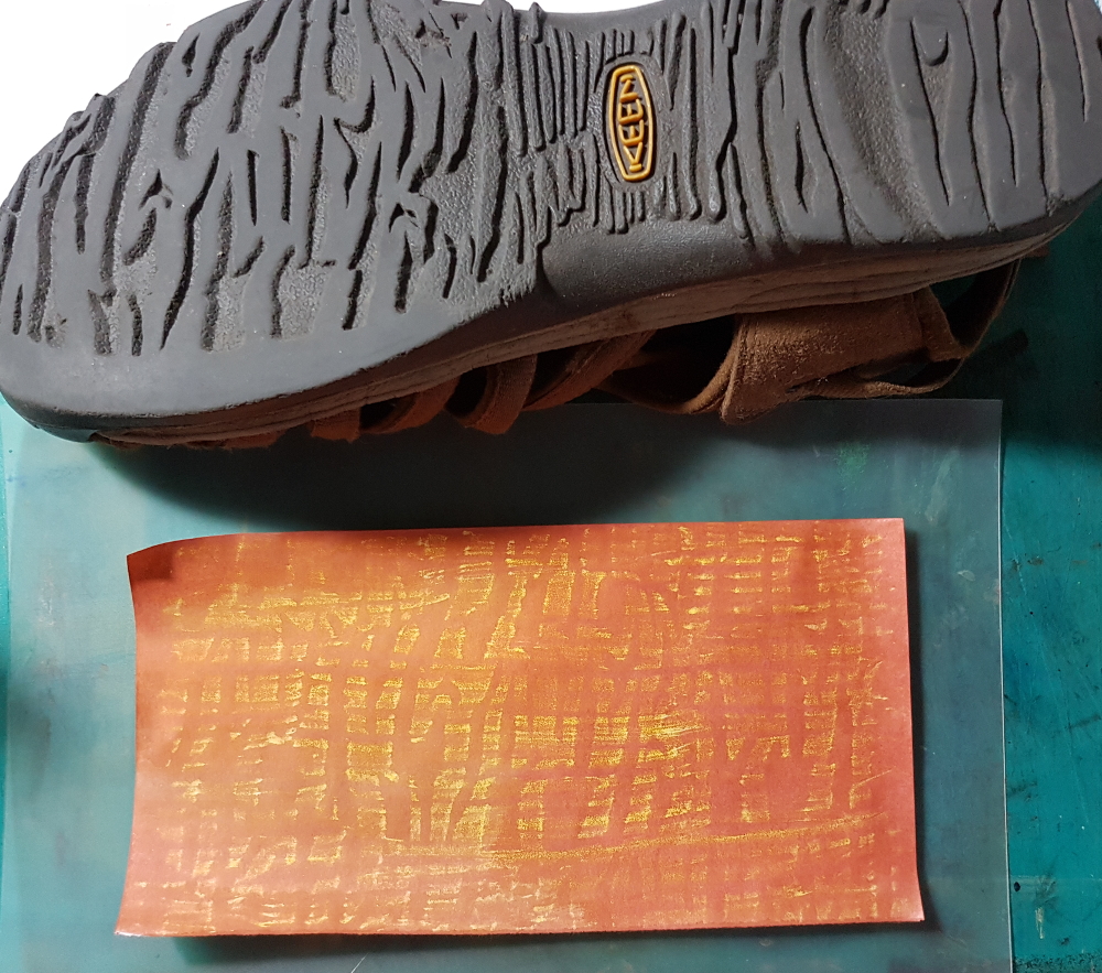
Here are some things I found to take rubbings of:
On the left, the door to my studio, on the right, the bathroom wall.
This is an interesting bamboo mat, found at a thrift store, on the bedside table.
On the left, an entryway floor tile, on the right, the seat of a bench made of old fence wood. Any of these rubbings could have been made with crayon rather than pencil.

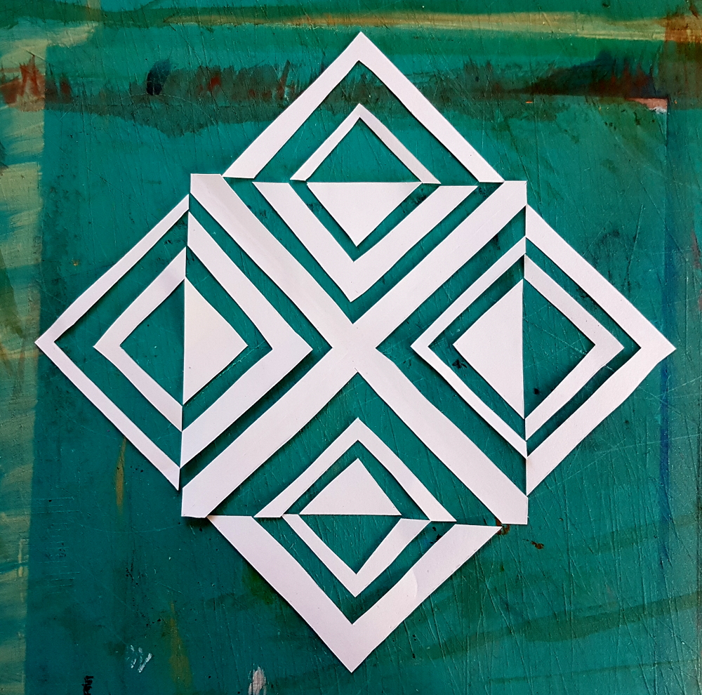
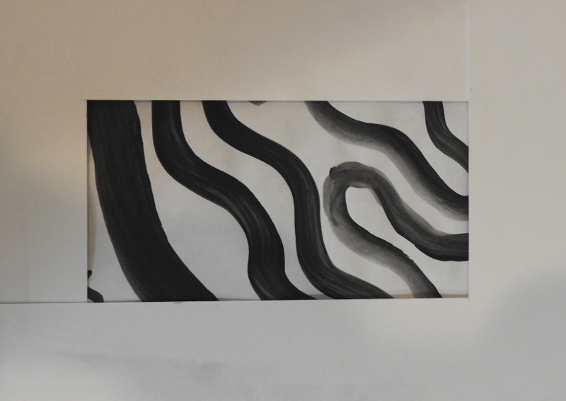
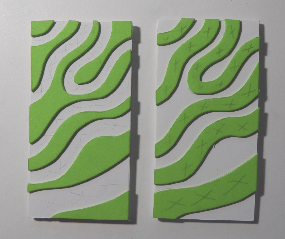
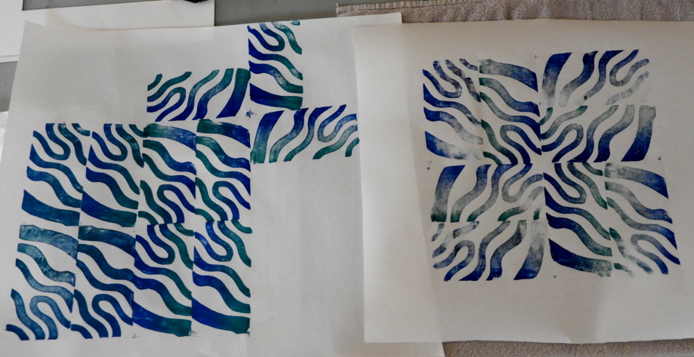
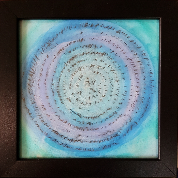
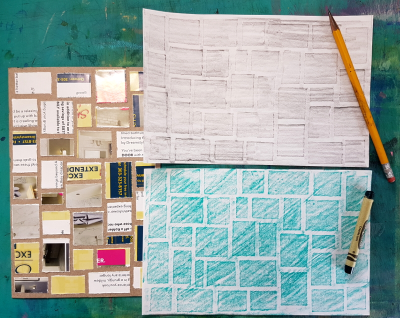
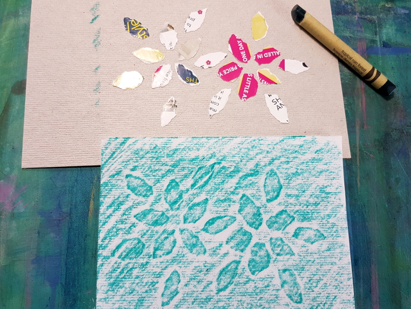
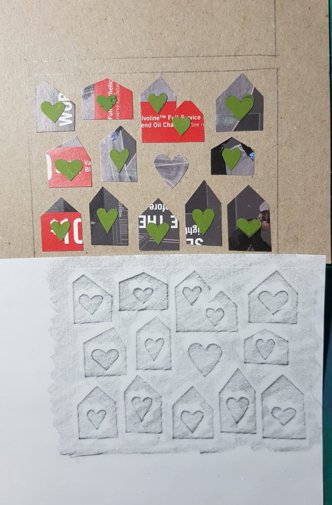
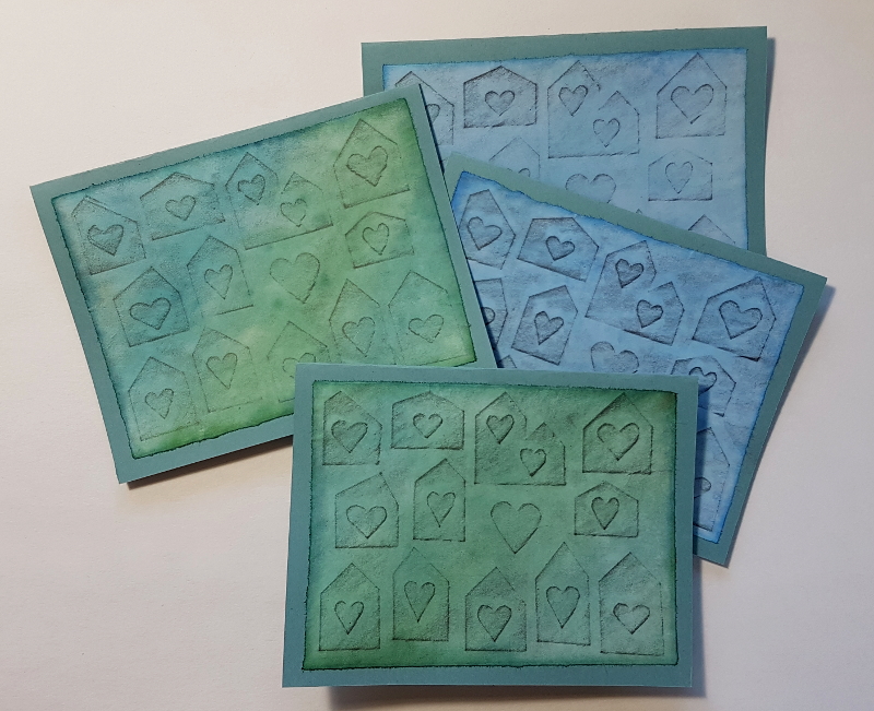
Now, let’s look at how to make your OWN textures to use for rubbings!   It doesn’t take a very big difference in the height of the surface to show up on a rubbing. My favorite way to do this is to cut or tear up a postcard from the junk mail, and glue the pieces down to a backing like the cardboard from a cereal box.

For this one, I chose to fold then tear the pieces, rather than cutting them, which gave the pieces straight sides, but softer edges than if I had cut them. They are glued to the background with a plain old glue stick.
Here’s the finished plate, and two rubbings taken from it, one with pencil and one with crayon. “Tropical Rain Forest” is one of my favorite crayon colors!
This is the first version of one with flowers, sized especially for making the fronts of note cards. I chose a textured cardboard background, (the insert from a package of postage stamps,) for a little more interest. This was a test rubbing, and I later added more leaves around the edges. These were roughly torn from the same piece of junk mail as above.
This is my favorite rubbing plate so far! The houses are from an oil change postcard ad, and the hearts are regular card stock, which is more flexible and easier to cut into small shapes. The layering worked great. You can see that I drew an outline on the backing, so these rubbings would be just the right size for the front of a card. This one is sort of topical; with everyone sheltering-in-place, I’ve been writing lots of cards to people who live alone!
One final thing I almost always do is paint over my rubbings with watercolor. The crayon actually resists the watercolor, where the pencil just shows through it. Sometimes I also go back and draw something else on top, especially for cards. These papers also make great material for collage, paper weaving, or paper mosaic!
Here are the finished “Shelter-in-place” notecards!

Thanks for reading! I hope you will try this at home, because it’s lots of fun!

Low-tech multi-layer prints

I’ve been looking for low-tech home-made alternatives to gel-printing plates for print-making. I happen to have two Gelli Arts plates, and half a dozen poured silicone ones for teaching, but lots of people could have fun playing with monoprinting but don’t want to spend the money. I tried doing it with aluminum foil, and that was not very satisfactory. But this week when I went to recycle a cereal box, I decided to try that instead. Here’s how it went.

On the left are the materials for making my plate. On the right, I have cut apart the box to make two pieces about 8″x10″, then glued them face to face with a glue stick. I cut all the seams off the liner bag, flattened it out, and taped it around the board.
Here I’m spreading a thin layer of craft paint over the whole plastic-covered board. I watered down the paint a little with water; if the paint is too thick (and a lot of mine is quite old,) it dries out before you can make a print. Too much water, though, and it would bead up on the plastic surface.
Then I make some sort of marks in the paint; quick, while it’s still wet! This is an old plastic card with notches cut in one end. (sorry picture is blurry; it’s hard to do something and take a picture at the same time!)
To pull a print, I put a sheet of paper face down on the plate, and rub over the whole thing with the palm of my hand, then lift the paper off.
Now, spread another layer of paint on your plate, and do it again! Here, I’m making pattern with a Q-tip. The little bit of the previous color of paint has dried on the plate by the time I get the next color out. Some of it might come up with this print, but that just makes it more interesting! I could print this design on its own sheet of paper, or make it an additional layer over a previous print.
This is my blue swirls printed over the previous pink radiating lines. I could leave it like this, or make more layers. I’m personally not fond of white spaces in my papers, so I could also wait till this is completely dry and then paint over it with watercolor in some shade that coordinates. The watercolor will mostly not stick to the acrylic, but will tint all that white background.
Here’s another favorite technique; spread a layer of paint, then grab a piece of plastic (thin plastic bags or wrappers from things are perfect for this. This was the wrapping around a frame.) Crumple it up and tap it down onto the paint over and over, turning your hand between taps if you don’t want a repeating pattern of the same marks, then make a print.

So, what to do with all these printed papers? Here’s one of many things I do with them:

I’ve been writing lots and lots of snail mail notes to people, especially friends and folks I know who might be feeling especially down or isolated, since at the moment we’re all “sheltering in place” because of the CV19 pandemic. So I just cut up bits of my prints, sometimes draw something extra on them with a pen, and glue them to half a sheet of cardstock folded over to make a card. As you can see, I’ve been having fun drawing “stitching” lines.

A Stitch in Time

After doing a whole bunch of “stitching” with dashed pen lines on various pieces the last few weeks (see The Pen is Mightier than the Needle, and Coming Home, below) I was craving some actual hand-stitching. The fabric is from the bodice of a dress that didn’t fit right, which I cut apart to make a skirt out of the lower part, and the thread is vintage crochet thread I found at a thrift store. It was originally off-white, and these bits were dyed with left-over dye from when I mix up a cup to use to tint paper. This marvelous smooth wooden embroidery hoop dates back to at least the 1960’s; I’m not sure they make them like that any more!

In the Flow

One of things I’ve been doing as an artist for a few years now is making kaleidoscopic mandalas, or “Creation Crosses.” (and sometimes Stars of David.) Usually I carefully pick the photographs I use. In fact, mostly I take pictures especially for that purpose. But the other day I was at my computer scrolling through the photos on the SD card from my camera, and clicked on something that I couldn’t remember what it was from the little thumbnail. Here’s what I clicked on: (it’s only about 23 seconds long.)

Algae in Tassajara Creek, just downstream from the mineral springs, in August of a dry year.

I couldn’t make a kaleidoscopic photograph from the video, but fortunately I had taken some still photos at the same time. Here is what I made.

In the Flow  ~ kaleidoscopic photograph by Janet Strickler

Flipping Out


I checked out a copy of this marvelous old book from 1959 called Creative Paper Craft by Ernst Rottger. Had to get it on inter-library loan, as it’s now kind of hard to come by. (and then all the libraries shut down, so I’ve gotten to keep it for a nice long time!) Among other things, it has some fun exercises for cutting and expanding one sheet of paper, either by moving the cut pieces farther away from each other, or flipping them out from the edges. Below is one of my experiments in cutting and flipping.

A lot of fun for just one little square piece of scratch paper!

Coming Home

Being stuck at home, like we pretty much all are, I decided to do something I’ve always wanted to try; a design exercise called The Journey, from an artist named Kim Thitachai, who lives on the west coast of County Clare, Ireland. She wrote about this exercise in her book Experimental Textiles, which I have checked out from the library a couple times, and has a short online course about it.

Here is my first attempt at the process, with an explanation below each photo:

The first step is to make a quick loose painting with only black ink or watery paint, along a long strip of paper. (This is about 12″ x 65″) It doesn’t have to be “about” anything, but this happens to be the story of my day on a Saturday in March when I realized I needed to cancel the Play-Shop I was teaching that day, as it was time to start keeping ‘social distance’ to slow the spread of Covid19. Included in the day are my errands to the post office, hardware store, grocery store, petfood store, recycling center, and then home, where my sweetie had made fresh bread and hot soup.
The next step is to use two “L”-shaped pieces of card to isolate sections of the design that might be interesting, and trace them. Here are a few parts I isolated
Here’s the final selection that I decided to use. I chose a fairly simple section, since it was my first attempt at this technique. It happened to be about twice as long in one dimension as the other, which came in handy for making repeats of a printing block.
The next step is to transfer your traced design three times; once to a piece of craft foam, and twice to two pieces of foam core board. For the foam core you can use carbon paper to transfer the design, but that doesn’t work on craft foam, so I did that transfer by going over the lines on the back with a charcoal pencil, then rubbing over the design.
Now the foam version is cut apart, and the positive shapes are glued to one of the foamcore pieces, and the negative shapes to the other piece.
On some large scraps of paper, I experimented with various arrangements of the block. The medium is acrylic paint, applied to the block with a roller.
By rotating the blocks as I printed, I came up with really interesting secondary patterns where the corners and sides of blocks met. Upper picture is just the positive block printed in dark blue, lower picture is the negative block printed over it in turquoise. The alignment of the blocks is never perfect, so there are lots of white spaces in between and within them.
So in this final stage, I flooded the whole thing with what was essentially watercolor made by dissolving dye powder (of which I have a large stash) in water. I chose a bright yellow green, and it gave the whole thing a sort of 1960’s block-printed poster look.
I decided that just as it was it lacked a something of a handmade touch, so as a last step, I used a light colored pen and drew stitching lines along the edges of all the blocks, and within some of them. Then I gave it a title; Coming Home. (because that’s the part of the original Journey painting I used.)

And then she set it on fire…

I just started working on technique experiments for my next big piece, which will be called And Then She Set it on Fire.  Here is what I did yesterday and today:

image

I grabbed a small piece of plywood, and a box of joint compound, and started spreading some texture on the board.

image

While the joint compound dried, I sorted through a big bag of crayons, (which I got for a penny apiece at Art Parts in Boulder,) and chose some colors to melt on the hot-plate I use for encaustic.   Then I let the joint compound dry overnight.

image

I was afraid the joint compound would be too absorbent to put the wax straight onto it, so I coated it with a light coat of clear wood stain, then when that dried, a layer of clear encaustic medium.  Then I went to town painting flame shapes with my melted crayons.

image

Here, I’ve fused the crayon layer with the encaustic medium below with a heat gun.

image

Now, I’m dabbing on some color in the form of OLD stamp-pad ink; so old that the red has turned to dark brown, and the price-tag on the top says 65 cents.  I’ve also mixed some of the ink into my clear shellac, and cover the whole thing with shellac, spreading out the dark brown ink, which sinks a little bit into the texture made by the plaster.

image

Lastly, after the coat of shellac and ink has dried for a while, I go at the surface with a propane torch.  The shellac melts back to form very interesting patterns, and the wax underneath softens and moves around, too.
Here is how it turned out:

image

Here’s something I’ve never done with crayons before!

http://www.artoftheordinary.net/classes

image

Getting ready for a Play-Shop titled “Playing with Crayons,” not surprisingly, I’m… playing with crayons!  This was an experiment in coloring on a rough ceramic tile that had been warmed in the oven.  I really
liked the way some of the colors bled into each other, especially the dark red and light green up the center.